
CASE STUDY THREE
In Case Study Two you got a peek at some updates to our Web Dashboard. The assignment for this project was to create an MVP experience allowing users to more conveniently manage the security of all their protected devices through our Mobile Dashboard App. In this Case Study, I will focus on some of the key UI and Interaction Design decisions that shaped our Mobile Dashboard App.
This was one of my favorite projects. As a small team (iOS Mobile Dev, QA Engineer, and myself), we were able to move nimbly around many cultural and organizational roadblocks set in place by a recent acquisition. While many other initiatives were delayed, and moral weakened, our little team delivered our consumer division’s first completely in house experience. Features were intentionally limited leading to this not only being our first, but also our best crafted experience. The Mobile Dashboard App is in a very strong place to allow us to deliver an experience that has not been possible in our other properties.
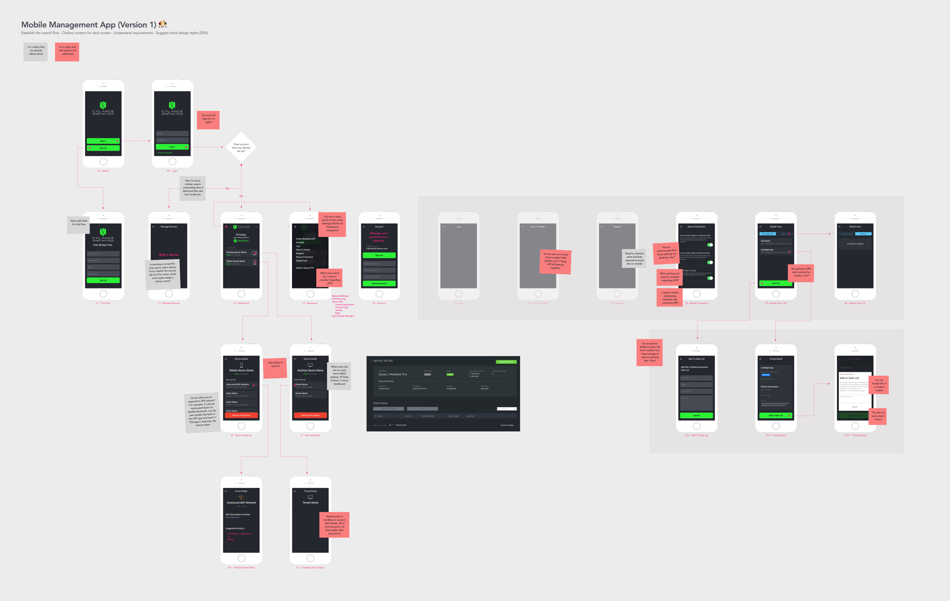
I kicked off this project creating a site map / app flow mimicking what currently existed in our web dashboard.
Text editors make great design tools
I then used text to represent each element that could appear on a screen and worked with teammates to determine which content needed to stay for a successful MVP.
Designing, redesigning,
tweaking, adjusting, scrapping,
crying, enduring, celebrating…
With a good idea of which content need to be on each screen, I could then start iterating until arriving at screens that felt right between me and the team.
Movement was a key theme for us. Since our other products were often perceived as not working or slow, I wanted to do all I could do to subtly suggest to our users that our app is as powerful as we describe it to be.
Users have found our UI to be confusing. I wanted to help our transitions between screens to be gentle and for screen content to load progressively. I also wanted our sections of the app to load progressively. Both of these make for a great transition because it is not just visually appealing, but it is a subtle way to make transitions smoother.
Clearly indicating a users threat status while not being annoying or overbearing is a delicate balance. That is why I explored nearly 30 different animations for our device status section.


I also wanted to design an attractive launcher icon that adhered to our global brand guidelines.
What We Delivered
Our team rose up to face significant challenges like team attrition, app store rejections, and partner challenges. Through it all, our Mobile Dashboard MVP still shipped! Meanwhile, improvements and new features are making their way into the app at a steady pace.


