CASE STUDY ONE
Yet many of the existing solutions use antiquated technology to solve modern problems. However, one company gained a lot of traction as they applied a smart and simple approach to keeping businesses safe. In 2018 I was excited to join a small and nimble team tasked with offering this smart and simple solution directly to consumers.

With a limited version of our enterprise product (which uses artificial intelligence to identify threat behavior), we aimed at offering that same smart and simple protection to individuals. Based on some market research (prepared before my arrival) we focused on three types of people.
Go To Gus
Go To Gus is the unofficial technical influence of the family. If you can’t figure something out, he is the one you call.
Momma Martinez
Momma Martinez desires to keep her loved ones safe online, but simply does not have the time to research how.
Online Gamers
Online Gamers tweak every aspect of their computer for maximum performance and appreciate light and effective software.
With a light version of the impressively successful enterprise product and a well-researched and robust target market, the consumer version of our product was released. There was just one problem,
It seemed that no one found our solution to be smart or simple.
Tom Greever, author of Articulating Design Decisions cleverly relates our role as a designer to solving a Rubik’s cube. Often teams are entirely focused on just one part of the cube, not seeing the bigger picture. This seemed to be the case when I arrived at my new job. No one had a shared view (or appreciation) of the customer’s experience. Before making any changes, we all needed to have a shared appreciation of the problem space.
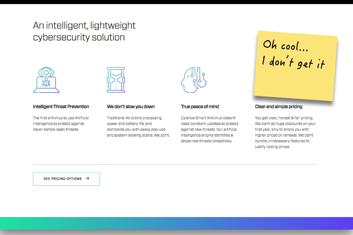
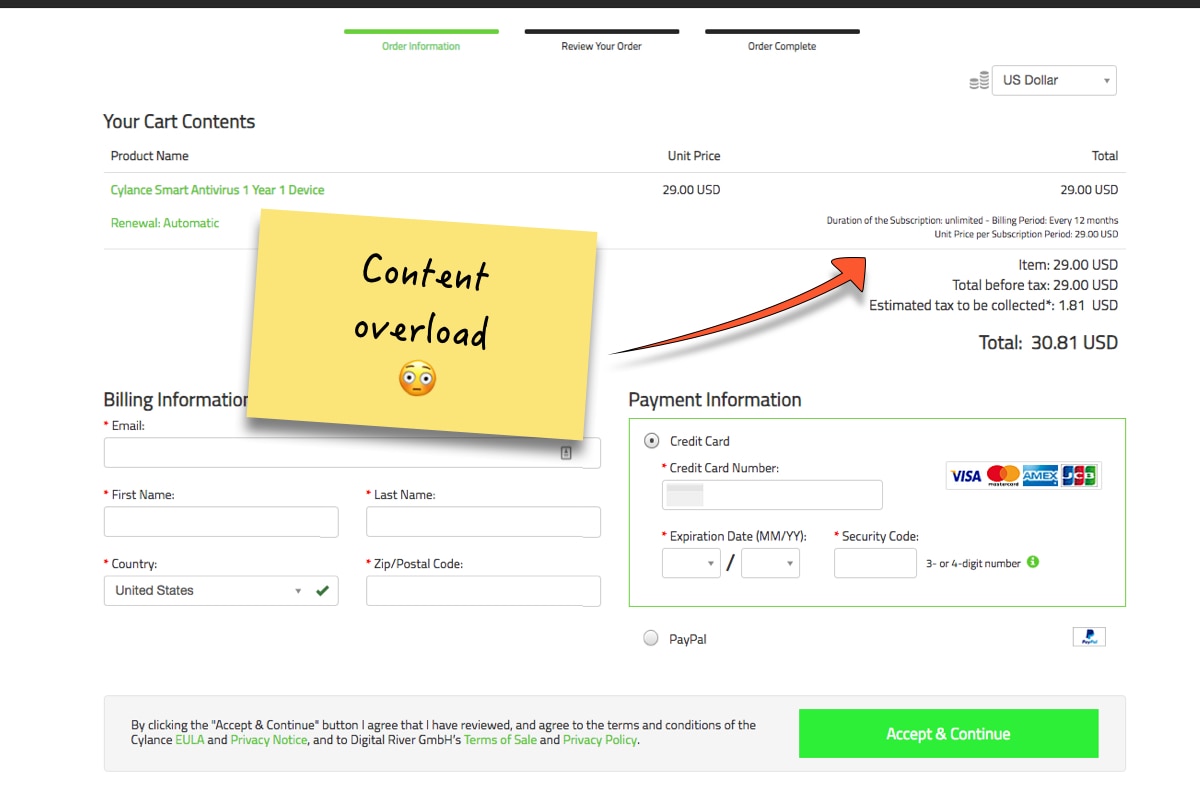
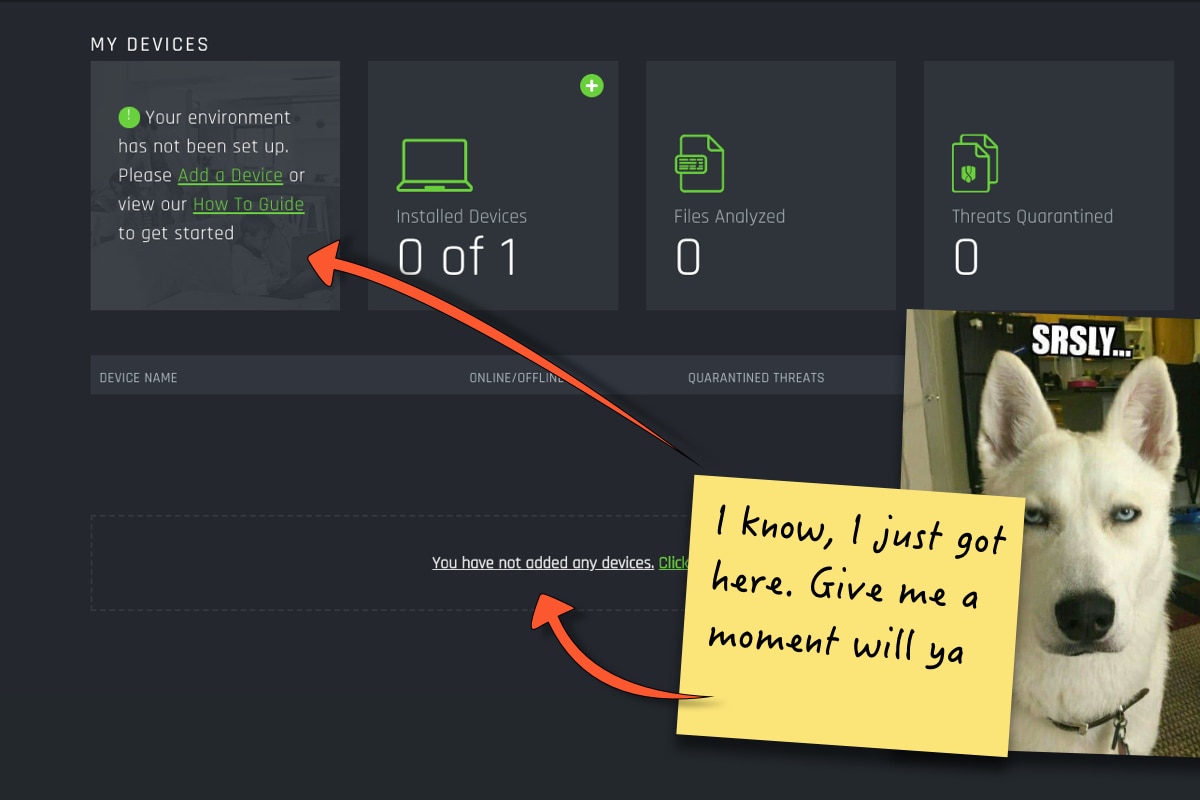
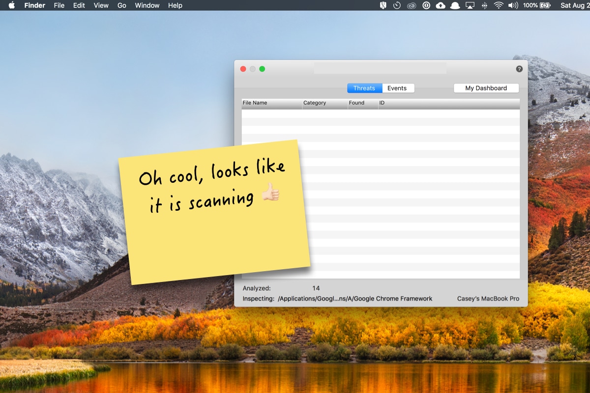
When cross-functional teams can see through the user’s eyes, it often greases the wheels of collaboration. One way of helping teams understand the customer experience is by leading the team through a teardown. I presented my review of the customer’s experience from the marketing page through the first moments in the product
But that was just my experience. I wanted to see how much of my experience rang true for actual people using our product. My search was cut short when I found out that we had zero analytics in place to help us see how users were behaving. With limited quantitative information available, I explored what channels were available to hear from users, and found three…

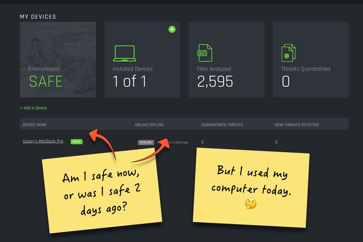
Summarizing recent support tickets and feature requests gave me insight into what I wanted to learn from users. I knew that sharing first-hand examples of customer’s jobs, pains, and gains, along with where our product met and missed expectations, would give clarity to the most important problem areas to address. Sharing quotes like the following helped us focus on the right challenges:
”"So it's still not clear that there is no desktop app. It's also not clear how I "run" your app? Is this a totally passive application?"
- Shy – Users are often confused as to if or how the product is working.
- Misleading – Our product provides conflicting and confusing information.
- Different – Our product unexpectedly deviates from common mental and UI models.
Now, with a shared understanding of the customer’s experience, we could start asking the right questions. Primarily we focused on asking How might we improve the experience to not be shy, misleading, and different, but helpful, informative, and pleasant. Working with the Director of Product and representatives from Engineering and Marketing, we generated and explored a number of solutions.
Impact + Difficulty Matrix
How might we make our product more helpful, informative, and pleasant?
Oh, and how might we do so with extremely limited bandwidth from our development team. For each idea, we sketched concepts, highlighted challenges & opportunities, and researched feasibility. We ended up prioritizing a short welcome video appearing in the dashboard as well as a series of very simple welcome emails.
The plan was to implement, measure engagement, and discern if these assets were helping users feel more informed and confident with their purchase.
Landing the plane
✅ Introduces a team with a challenge.
✅ The team creates a master plan.
❌ Implements plan and succeeds (or learns why they failed).
I wish I could share all that we learned from implementing these solutions, but often plans don’t go as expected. This story doesn’t end with what we learned, but continues on with what changed. My second case study describes what happened next as we entered into a partnership and navigated an acquisition.
