
CASE STUDY TWO
This case study outlines how we added significant functionality to our product, but designed a solution that actually simplified the users’ experience while also allowing us to better represent the value we offer. There are two themes to this story, increased functionality and decreased complexity.
Part One: Increasing Functionality
As mentioned in my first case study, the world of Cybersecurity is complex and rapidly changing. That is why I love working every day to make it easy to protect your digital assets. For some time, my company only protected desktop computers which is why there was much excitement when a partnership was announced to help us also offer mobile protection.
It’s Complicated
Two enterprise-focused technology companies with no history together decide to collaborate on their first consumer app, how hard could it be? Well, depends who you ask. Our eternally optimistic Sales Enablement guy who closed the deal thought that all we needed to do was change the logo and some colors. Let me briefly explain why it was just a little more complicated than that.
After an initial meet and greet and one day ‘let’s figure it all out’ working session, we surprisingly did not have everything figured out. I started by figuring out what I needed to figure out. The Look, Understand, Make was a helpful framework to apply to this circumstance.
Look
I first needed to figure out things like:
- How does their technology work?
- What structure and language do they use to indicate a device’s status?
- Who on their team can I ask and how will we communicate?
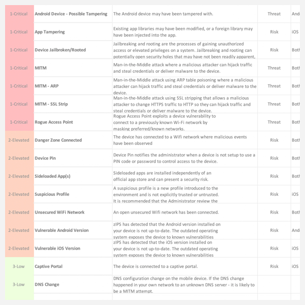
Each of these top-level questions unfolded into more questions, which unfolded into more questions. Eventually, with the help of flow charts and simple text editors, I was able to make sense of our relationship and what were some key areas that needed definition.
I was able to help both teams gain clarity and alignment by working with my Director of Product Management to document the details of every type of detection in excel and then I created a flow chart to illustrate the behavior of each mitigation action.


Understand
Knowing which metaphorical pieces we had to work with, we could then start shaping what our shared experience could look like. This phase of the project was largely experimenting with sketches and low fidelity prototypes and presenting them to different teams looking for holes in our experience. Through all our iterations, two helpful ideas emerged, the Activity Log and a Simple Status Headline.
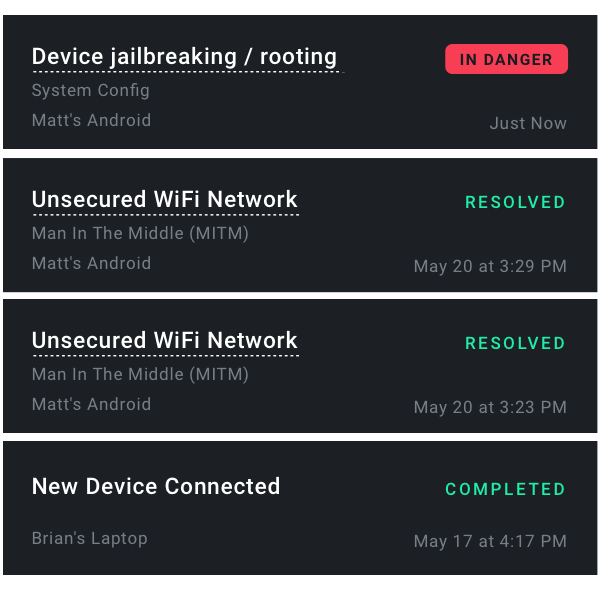
Activity Log Though our product is very effective, it does very little to inform the user of what it has done for them. My research has found a theme of users being unsure if the product was working. As I was exploring how to add the concept of mobile security, I wanted to be careful to not create further confusion. With these challenges in mind, I created an activity log. This would give us a single place and a single format to regularly communicate to the user all that we are doing for them. It would also allow us to better explore which types of activity items users found helpful.
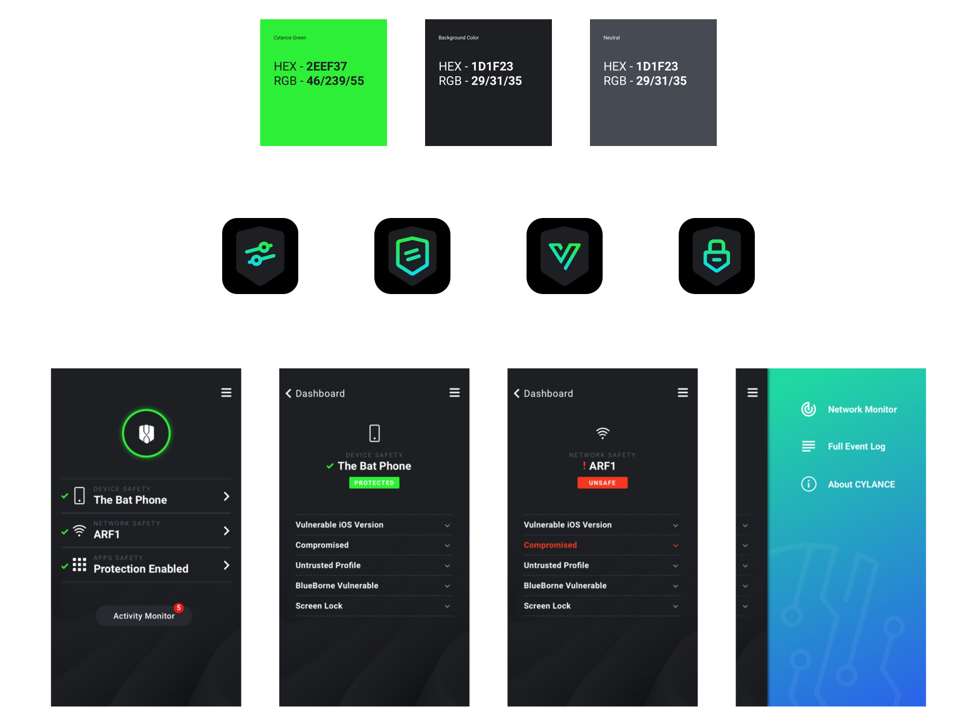
The Simple Status Headline was another attempt to reduce confusion and increase confidence in our product. This headline allowed us to remove some secondary information that users found confusing and replace it with a headline at the top of every page clearly informing the user of their current security status.
Make
With much of the behind the scenes work now clarified and aligned on, our teams were ready to design and refine our MVP mobile security app and integrated desktop experience. I worked with our partners team to provide UI assets and to turn words and flowcharts into prototypes, continually clarifying for all parties what the desired experience would look and feel like.
Part 2: Decreased Complexity
Our product that once just protected desktops now protects mobile devices. Mobile security and mitigation actions are completely different from traditional desktop computers. Desktop vulnerabilities generally manifest in the form of infected files. Mobile vulnerabilities however, are much different. They are more about the current state of many circumstances affecting a single device. My redesign of our web dashboard merged different mitigation actions into one simple and singular language, allowing users to always know the answer to their most important question, Am I safe right now?
When all was said and done, our product protected a completely new type of device (mobile) and new content was added to the UI of our web dashboard (activity log & headlines), yet overall complexity decreased. While I will nearly always promote the idea that less is more, I learned a prerequisite, which is that you must first start with the right information.
Our new UI now helps users better determine the status of any or all their devices.
Before Redesign
The previous design shows conflicting and confusing information. Metrics that are not informative are given priority while important actions are subdued.
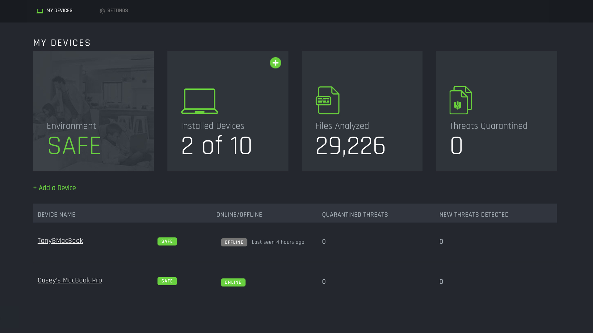
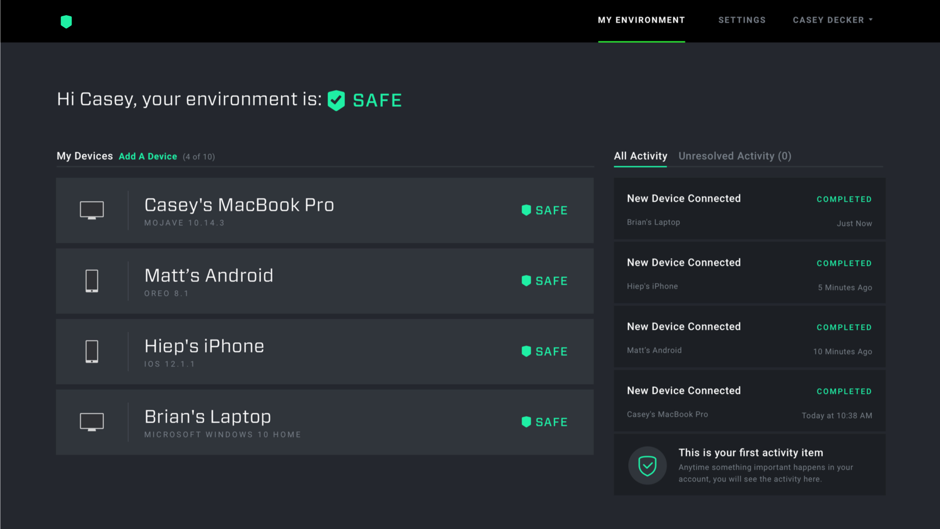
After Redesign
All pages follow the same structure and adhere to an improved content hierarchy. What is important is surfaced and contextual inquiry to surface important content at the appropriate time.
Wrapping Up
With change comes opportunity. A partnership gave us permission to not only add functionality but also make some much needed improvements to our web dashboard. These changes are just now being released, so I am eager to learn how we did, but I anticipate fewer support tickets asking if our product is working.